Inspiration: The Woman in Black - then and now
 The woman in black is a horror fiction novel by Susan Hill made in 1983. The story is about a ghost that haunts a small English town and foreshadows the death of children, the story is centred around the character Arthur Kipps as he struggles to endure his stay in this remote, cut of house where the ghostly female resides From the books establishment it has been adapted into many different things.
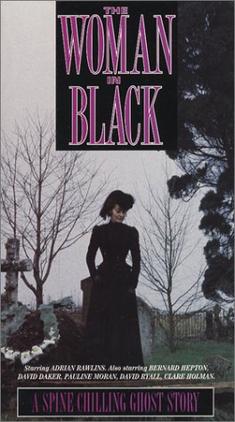 It was adapted into a broadcast adaptation on BBC Radio, as stage play by Stephan Mallatratt which became very successful and then into a television series for ITV made in 1989 named after the book itself. The television series was an unsuspecting hit from its audience and only featured slight small changes from the novel for example Arthur's name changed from Kipps to Kidd and the dog from being a female to a male.
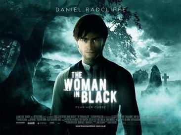
Now in 2012 another adaptation has been made of the novel as a film called The Woman in Black and stars Daniel Radcliffe. It has been made into a thriller film and has been produced by Hammer Film Productions. Hammer is a United Kingdom based production company founded in 1934 and is most famous for its Gothic 'Hammer Horror' films made in the mid 1950s until the 1970s such as Dracula, Frankenstein and The Mummy. The Woman in Black throughout all its adaptations have always kept being as scary as the ones made before. It is a 'spine-chilling ghost story' that still today we keep everyone at suspense and total fright.
The font title of the Woman in Black has changed throughout the different versions but still remain to have a sense of terror. The books font of the title is quite formal and rounded, it doesn't look scary but creates a false sense of insecurity.

In the film adaptation the title is white, bold and gives off a white glow. This alone tells the viewer that the story will be haunting and the glow of light suggest something its supernatural.

In the television adaptation the title is quite long and thin. It has sharp edges and suggests a story of pain and terror. The main words 'woman' and 'black' are elongated more than the rest, to tell the audience that it is the main feature for the television dramas body.
The titles show how the font is an important part of a films opening and promotion as it is one of the first things the audience will see and will give signs to them about what the film will contain. In our film opening we will ensure that our films font will en-tie with our films plot.
No comments:
Post a Comment