Friday 30 December 2011

The Devil Inside

The Devil Inside poster 


The Devil Inside is a thriller that is based on a woman who becomes involved in a series of unauthorized exorcisms during her mission to discover what happened to  her mother, who allegedly murdered three people during her own exorcism. Whilst  seeing the woman trying to find out what has happened to her mother it then is shown to get out of control where we then see several people result in dieing due to this traumatic situation 


This film i was attracted to instantly as well as the poster shown above, the film was interesting as it was different from several other thrillers which was interesting. Even though we see that the storyline was different to other thrillers and horror movies we see that the shots and other conventions were similar. The poster also caught my attention through the use of colours used, the colours were dark and in some ways interesting. The colours such as dark reds, whites and blacks all give the negative connotations of death, war and danger. The image on the poster is shown to take up most of the poster (ECU) again showing the main focus and detail upon the characters face, this also suggests that the person on the front will also be seen in the film who will be focused on most of the time. Looking at the main image we also see there are lines upon the characters face which seem to look like scars this could give us the connotation of the character being scared of something she doesn't want to become in which this case is the devil. The text is shown to be plain and white to stand out from the dark background. The text also gives us the connotation that people in the film could be confused and lost about there were about as the word inside is spelt backwards. 


Opening of Thrillers (conventions)

We also see the way the opening title and credits are represented all shown to be presented in dull colours but with bold interesting font. Thriller openings are usually presented in a dramatic way to make it more appealing for the audience some examples have been indicated below.

Psyco opening credits 

The opening of Psyco is different from other film openings we 
see whilst the credits have been shown the theme is shown to overlap one another not allowing the viewers to see a clear view of the directors names this is used to create an effect that the audience may not expect such as tension due to the music also being played 
Psyco opening tittle
Above is shown to be the title of the film. This clearly represents the name of the film in a clear way, this is because we see that the image, font and colours used all show to give us the negative connotation of death, blood, war and so on. Red is the colour that is usually associated with danger and strength, this being used over the object clearly suggests that more than one person dies the title is represented to take most of the space on the object this clearly suggests that this may be something we focus on during the film.

The Ring opening
Looking at the opening of this thriller we see that the screen is blank creating tension for the viewers of the film.
Opening credits of The Ring 
The font of the credits above is shown to be bold and simple but is shown to have different levels to show the mood. Looking at the font and the music being played behind clearly links in with the genre allowing the audience to expect something terrible during the beginning of the scene.
The Ring credits (shown to be placed in
different directions with noises)


Having credits being placed in different directions as shown above makes us see the importance of the character.  
Most of the credits in thriller movies are usually presented alone with a plain black background to allow the viewers to see that this is the main focus. Having nothing in the background clearly represents a thriller opening as the object is usually placed alone to show the main focus. We also see the colours used represent this as they are shown to be plain blacks and whites to stand out and exaggerate the mood
The Ring title opening 
The image of the ring opening is bold bright and effective. The use of the font and text is shown to be spread out as shown this gives us the connotation that the characters used could be separated and may find it hard to reach there destination. The use of the logo being placed in the middle again shows the main focus as there is nothing around it to distract what the image is trying to tell us.


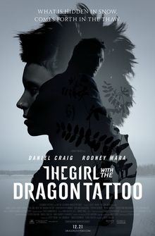
The Girl With the Dragon Tattoo

The Girl With the Dragon Tattoo (2011)

Theatrical Release Poster

Recently the film The Girl With the Dragon Tattoo has been released in the cinemas. A drama/thriller adaptation of the book by Steven Zaillian, follows a man's mission to find out what has happened to a girl how has been missing for 40 years, who might have been murdered. The film follows his story and how he meets a mysterious computer hacker girl in his findings. 

The film trailer and poster has really caught my eye. The colours used are cloudy greys, and blacks and gives the look of the film that extra edge. The font of the writing also gives the poster something extra, it tells the audience about the film and how its not your typical type of drama/thriller.The way the 3 images are merged into one shows how all these things can relate to the whole and is very cleaver.

The Trailer

The Girl With the Dragon Tattoo, a recent modern day thriller is inspiration to me as it shows the real meaning of a good thriller without it looking too made up. 

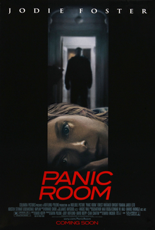
Panic Room Elements

Elements of Panic Room that Inspire


Theatrical Release Poster

Panic Room is an American film made in 2002 and is a captivating dark thriller about a  mother and daughters struggle for their lives and the safety of there homes. 

Plot:
The plot of the film is not the typical horror/thriller plot of the distressed woman being hunted down by a ghostly figure but is more realistic and more believable to watch. The film see's a woman who just divorced her husband and had recently brought a house with her 11 year old daughter. The previous owner of the house had installed a 'panic room' in the house for the safety of the home-owners. The panic room is secured by concrete walls on all sides, has a thick steel door, has a security system with surveillance cameras and a separate phone line. On the night of the move their house is broken into by robbers who are looking for $3million dollars locked in a safe in the panic room. The mother and daughter reside to the panic room for their own safety as the robbers try to get to the money. The daughter Sarah who has diabetes suffers from a seizure and has to get  her jab before the matter gets worst. As the mother leaves the panic room to get the injection, one burglar enters it and has to help Sarah. After many attempts at trying to contact help it fails but in the end the robbers get caught and the mother and daughter decide to move to  a more fitting home. 

Characters:
The characters in the film are very basic and showcase the casual family unit in the modern 21st century society. A divorced couple with a daughter to look after. 
The mother, Meg a strong woman who is good headed and wise.
The father, Stephan a trying willing man.
The daughter, Sarah an 11 year old girl, brave and suffers with diabetes.
The roles of the characters many people can relate to and find find the film more appealing to watch.

Setting:
A home in the upper west side of New York City.

Lighting:
The lighting of the film throughout is a dark, mysterious cold blue with cloudy greys and blacks. The colours reflect the darkness of the plot and the matters the characters are face with.
Here are some shots of the film that show the dark colour pallet.


Camera Shots:
The camera shots in this film are very much a range of distances, angles and positions. In the film there are many close ups of the characters face to show expressions, wide shots of the area (normally in the house), midway shots two shots and many more.
Here are some examples of camera shots.


High angle, wide shot


Closed in, two shot, close up


Close up


Low angle, two shot


My most favourite part of the film is the part when Sarah has a seizure, the part is so well acted out and all the elements to make a moving picture- mise en scene, sound, camera, editing and lighting are all used to make the scene as real as possible.
Here is the part of the film where Sarah suffers from a seizure whilst locked in the panic room.


Panic Room inspires to make an opening to a film sequence using the same features as it does 
The lighting, characters, plot and timing of everything work in unison with each other and creates a great thriller film, that's good to watch.


Shot by Shot Remake: Comparison

Comparison of original to own production

Our remake of the film clip of Collateral shows more signs of differences than similarities, though never the less it was a good exercise to start off our filming process. 

Comparisons:
  • The framing off the clips (but one)-we used the rule of thirds in all our clips to make sure that all the spaced was filled.
  • The camera angles- the angles follow directly of that used in the clip for example the worms eye view of the bag on the floor and the behind the shoulder close up shot were our strongest.
  • The similarity of the positions of the people to the storyboard/clip- each still shows a reflection to the storyboard, the positions of the characters mimic those in the clip.
  • The sounds of the clip- the sound was used directly from the clip itself and so sounded very much the same, with our background sound muted to hear the sound properly.
Differences:
  • The continuity of our clip throughout was a major problem- although to us the clip made sense, to a person who never seen the clip it would have not been obvious. In the clip there are many people around as it is set in an airport terminal. We tried to create the same sense of busyness but as the group is small we used the same people twice but as different characters, though when played back realised that  it looked like the same character was walking two different ways so the clip did not flow. 
  •  Some parts were missed out- some parts we forgot to play, for example we dropped one bag but in the scene two bags were dropped, this could have been a vital part in the movie as a hole.
The good:
  • The actual filming process went very well, we managed to film all our clips in the time allocated and managed to play back our recorded footage on the spot to see if it needed re-recording.
  • The process of editing too went very well. We worked together to place the clips in order and to change the duration, time of the whole clip and the sound added onto it.
  • The editing of the transitions gave our clip a smooth overall out come.
The bad:
  • Not all the scenes made sense ie the continuity of it all.
  • One shot used bad framing as there was too much space above the subjects head.

Overall for a first go as media students doing a remake i think it went very well. We learned the importance of a storyboard as it is very useful on set and learnt how to use Final Cut to our ability. Although there were some mistakes of the outcome it was a lesson for us not to make the same mistakes again, better to make them now rather than later.

Thursday 29 December 2011


Shot by Shot Remake: Editing process

Editing Stills

Once we had filmed our remake we edited our footage for it to make sense and to follow the sequence accordingly. We used Final Cut on the mac pc's to do so. 

Final Cut is a very good tool in the editing process. There are two integrated screens to space things out and technology to get the best outcome as possible. The screen is slit into three parts, at the bottom is where the clips are put into order and placed where sound can be added onto afterwards, the top left hand side shows the clip in edit and the top right hand side shows the outcome of the clip just edited.
To get the clip to start and cut at the right moment the buttons I and O are pressed to do do, I standing for In and O standing for Out. These buttons made out clips flow better without any bloopers in the beginning and ending of the clips we filmed. 

When editing we had to consider the order of the filmed clips and the movement of speed and at the end we added the actual sound of the cilip on top of our to make it sound like the movie clip itself. To do this we found the clip on you tube and converted the file to an mp3 so it was able to copy onto Final Cut, placing it on the bottom part of the screen to place it at the right parts only leaving the sound of the bag dropping as original sound. 

Here are some stills that show the editing process.


These stills shows how we were trying to make the first clip we filmed to be slowed down in duration as the time in the movie is much more slowed and calm. To do this we clicked modify, then to the duration and always used around 4/5 seconds, this took several times to complete but once we did it, we managed to do the same for the other clips needed. The stills show us trying to place our clips in chronological order and trying to add effects of smooth transitions onto the next scene.

Shot by Shot Remake of Collateral: Original Stills

Stills of main camera shots of Collateral


In the clip of Collateral we see a range of camera shots showing close up, slow motions of John Cruise with a blurred background, and the same of Jason Statham, then follows two shot, over the shoulder shots of the two when they meet with cutaway shots of the bag and an over the shoulder shot of John Cruise when he walks away. This is the stills of the original clip of the clip we have to remake in our groups.
                             COLLATERAL REMAKE
This is a longshot over the shoulder shot

Over the shoulder shot of the main character the lighting was very tricking outside
This a closeup of our protagonist as shes walking out of the shot
This is a lower half body shot to show the significants of the bag in this shot 

Worms eye view of the bag again 

This is another trial of us shooting the walking of the main  character 

Medium closeup

Another shot of the protagonist leaving the shot we found it terribly hard to film which is why it looks alittle blurry


This was our first go with the cameras and we chose to shoot outside so we could play with the lighting and use the lamposts to give it originality, we wanted to see how we worked with the camera offsite. We found it difficult to get the camera at a straight angle due to the slant of the road we were filming on, but this was just one of the problems with the filming. We found that using the same characters in several of the shots made it difficult for viewers to understand what exactly was going on in the sequence, so in one shot you can see outsiders in the background we asked them to be involved in our short film to help it make more sense.


      THE COMPARISON TO THE REAL 'COLLATERAL'

              Below are shot by shot of what we filmed in ou clip of the collateral


As you can obviously see the main and very noticable differences between our remake to the original collateral. The fact the actors are prodomantly male, the setting, the amount of characters needed, the passer buyers and the storyline in general in our remake was muddled up, we will really need to work on this when filming out thriller.


This is our filiming of the collateral


Conventions of film openings:Art of the Title

Art of the Tile: Juno 


Art of the Tile is a website that show the art behind the title sequences of some popular films. Its archives range from The Lady in the Lake made in 1947 to Kung Fu Panda made in 2008. 

Juno made in 2007 which is about a teenage girl who is pregnant and decides to give her baby up for abortion. The title sequence of this film was designed by Gareth Smith and Jenny Lee and produced by Shadowplay Studio.


This link takes you to the video of the title sequence on the Art of the Title website


As seen through the stills of the storyboard, we see that the opening of Juno shows and follows  the main conventions of a film opening. 

It firstly introduces the audience to the films production company, Fox Searchlight Pictures, Mandate Pictures and Mr. Mudd Production. It then shows who the film was created by which is Jason Reitman and finally introduces the film as the whole by displaying the films name. 

It then goes on to introduce the actors and actresses names in the opening the main ones being first and so on. Similarly the names of the films production team are added with the names of the costume designers, the directors, the producers, the music performers of the added song and the film editor.

The credits are also very skilfully designed to fit the film and the music it plays along to, the colours show a simple palette of blues, creams, greens, oranges and red to show how the character is always in her own little world.


Wednesday 21 December 2011

Elements used in thrillers

Below are images that suggest different types of characters used in thrillers. These images all show to have various aspects in common in which this case is the lightening, setting, characters,camera shots and also the plot of the film. These are shown to be significant fetchers that need to be applied when making thrillers as it sets the mood allowing the audience feel involved and excited in what is going to happen.

Lightening:
The lightening is based around dull but bright colours that has been reflected upon the characters face to show the expressions perceived and also giving a clear representation to the viewers that they are the main focus. The background of most of these shots taken have been blurred showing that it is not important and that the focus is applied on the subject which is often based around the characters. 

Camera Shots:
Most of the shots that have been used make it clear what the main focus is. Close ups have been used to show detail upon the characters face allowing the audience to see the expressions on there faces. We also see wide shots of the area in which the scene has been set that is shown to take place when the action appears mostly in unexpected places.

Setting:Most of the settings indicated below show to be placed in atmospheres where the character is alone and isolated. The setting is the most important element when considering a thriller as the setting allows us to generate a mood as shown below. If the setting is empty and is usually represented in cold colours then we will expect to see something terrible whist we continue watching.

Researching images of characters that are used in thrillers helped me generate an idea of what i will need to use within my group for it to be as successful as original thrillers. Whilst looking at these it had also made me realise that using costumes is also significant as it also generates the mood such as within the first image we see the characters costume reflects the feelings that have been perceived on her face to give the viewers the connotations that she is angry and is about to kill someone.

The Ring
The Ring
Trick N Treat
Paranormal Activity
Orphan
Paranormal Activity